
Manage Reports and Dashboards Through…Reports and Dashboards
Reports and dashboards are our analytics engines. They provide us the data and insights to make business decisions, measure performance and help steer the direction of the company. Over time though, monitoring and maintaining these can be difficult. Countless reports, folders and dashboards pile up over time, many often being little used and others essentially duplicates. So how can we simplify the governance an upkeep of these tools? Let’s see how we can use reports and dashboards to help manage themselves.
Reports
A lot of Orgs allow most users to create reports. This can lead to a very large volume of reports being created. Some may have just been able to have been a SOQL query to produce the results, but were done a report that was used once or twice. A best practice is to clean up and deprecate unused reports on a regular basis. To help do this we can create a report to identify the last time a report was run. This gives us our initial group of deprecation candidates. The frequency and interval will be a bit different for each company, but in general I find that anything that hasn’t been run in over a year can go. My normal practice is to do this as part of quarterly maintenance and generally I move the identified reports into a folder that most users do not have access to. If there’s no one asking where these reports went by next quarter, they can go (no one has a favorite report that isn’t run at least once a year). Note: this does not cover reports in private reports folders for users other than that of the viewer.
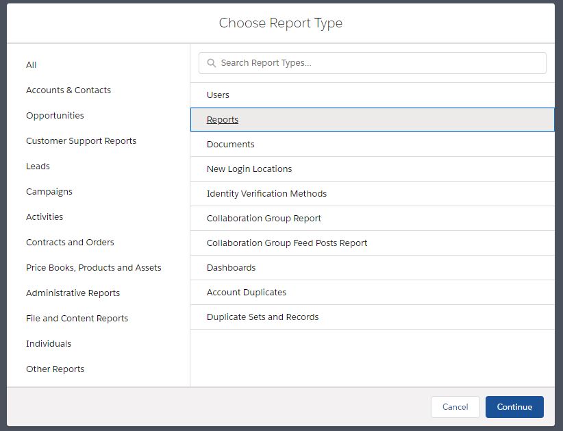
Another encouraged best practice when it comes to deleting reports is make sure that they aren’t used in dashboards. You can image a users’ frustration when a a dashboard has one or two charts that are not functioning properly because the underlying report has been altered. We are certainly not going through each and every dashboard to inventory which reports are used in them, because, you guessed it we can see this in a report. To do so, our first step is to create a custom report type. We’ll use Dashboards as the primary Object and Dashboard Components as our secondary.

Speaking of custom report types, keeping track of these can be tedious. Often we see numerous report types that are very similar and sometimes not optimally named. We can use a report to provide insight on our custom report types. Grouping these by type can surface high level metrics. keep in mind that the type is really just what you’ve named the custom report type. By evaluating these you may see trends that allow you to combine types in order to streamline report type selection for your users. To do so we’ll need to create a custom report type that has more fields available than the standard one.
Here is how we can create these reports.
Folders
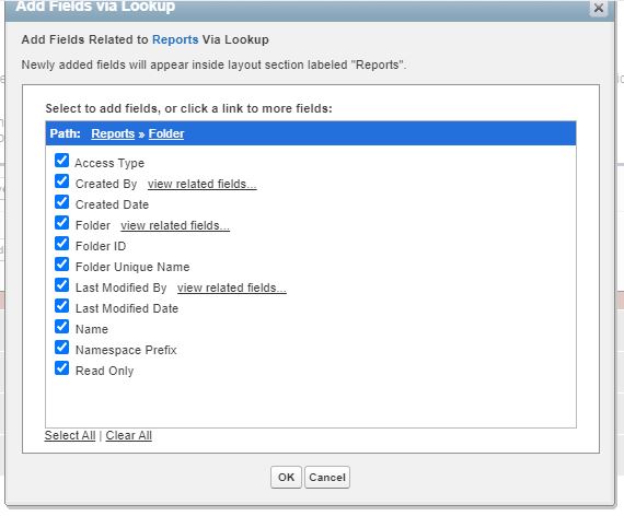
Folder maintenance is also a monotonous task. Identifying folders that can be consolidated or deprecated can be a bit tricky. One way to do this would be to identify which folders have few reports in them (note: we cannot report on empty folders). Using the same standard report above, we can group and summarize our reports by folder to help identify these. However, what if we wanted more information on the folder itself? We can create a custom report type using Reports as the primary object and through editing the layout we can add additional fields via a lookup from the Folder. This can provide valuable information such as who created the folder and when, as well as whether the folder is private, shared or public. A good use case is to evaluate Folders when someone leaves a company to determine whether these reports and Folders should remain or be re-purposed. This type of report can also be used when determining access level changes for the data to audit which Folders and Reports are accessible either as public or shared versions. The same types of reports can be used to manage Dashboard Folders as well.
Let’s take a look at these reports.
Dashboards
Dashboards are often the first thing that users look at each day. It’s very common to embed these on home pages or email via a subscription daily. They provide a synopsis of key information and metrics through visualizations within their charts. A not uncommon problem is that a dashboard stops working seemingly out of nowhere. The usual culprit for this is that the running user of the dashboard, often set to the person created it, has had their user record deactivated. This prevents active users from being able consume the data. A way to avoid this issue is by reviewing who the running users of each dashboard is prior to deactivating the user. Going through each dashboard one by one to check this does would be time consuming, so an easier way is to create a report that identifies all these users at once. We can use the same custom report type as above with Dashboard and Dashboard Components for this example.
Another good use case is for tracking dynamic dashboards. Each org has a limit of how many of these we can have based on your edition (0 for Professional, 5 for Enterprise, 10 for Unlimited and Performance). Nothing is more aggravating than creating a bunch of reports, adding the charts to a new dashboard and then trying to set the running user to viewer only to realize you’re already at the limit. We can use the same report that showed us who the running user is to highlight which dashboards are dynamic to help us see how close we are to the org limit as well as have a reference point for exactly which dashboards are set to be dynamic.

As your volume of Dashboards grow, a periodic review of the usage can help surface Dashboards that are infrequently or no longer being used. There are no reportable metrics on when the Dashboard was last viewed or by whom, however, we do have at least one option to help us. De-cluttering can be done utilizing the the last run field from the underlying reports as each time the Dashboard is refreshed the underlying reports are run. Group your report by the Dashboard name and then sort by the Last Run field.
Reporting on the design preferences of dashboards can also be very useful, especially if you’re new to an Org and want to understand what the users are used to for the look and feel of their dashboards. Within our reports and can see things like whether light or dark them is used within components, which color palettes are most used and what chart types are the most popular. This allows us to provide a familiar format for our stakeholders when designing new dashboards.
Below is what these reports look like.
Categories
Aaron Crear View All
Aaron is Founder & Principal at Hat-Trick Consulting. He works with companies around the world to help them achieve their Salesforce goals through administration, development and architectural services. A former sales director, Mr. Crear has extensive functional and technical expertise translating business requirements to technical solutions. Aaron currently holds 10 Salesforce certifications including Salesforce Certified Data Architect, Sharing & Visibility Architect, Sales Cloud Consultant, Service Cloud Consultant, Community Cloud Consultant, Platform App Builder, User Experience Designer, Advanced Administrator, Administrator and AI Associate.
He is also the leader of the Lowell, MA Admins Community Group and is a co-organizer of Northeast Dreamin’. Mr. Crear is a frequent speaker, having presented at Dreamforce, Albania Dreamin', Big Sky Dreamin’, Cairo Dreamin', Czech Dreamin’, dreamOle’, Dubai Dreamin', Florida Dreamin', French Touch Dreamin’, London's Calling, Midwest Dreamin’, North Africa Dreamin', Phillyforce, Polish Dreamin', Portugal Dreamin', Snowforce, Southeast Dreamin’, True North Dreamin, YearLeadin’and Salesforce World Tours.
